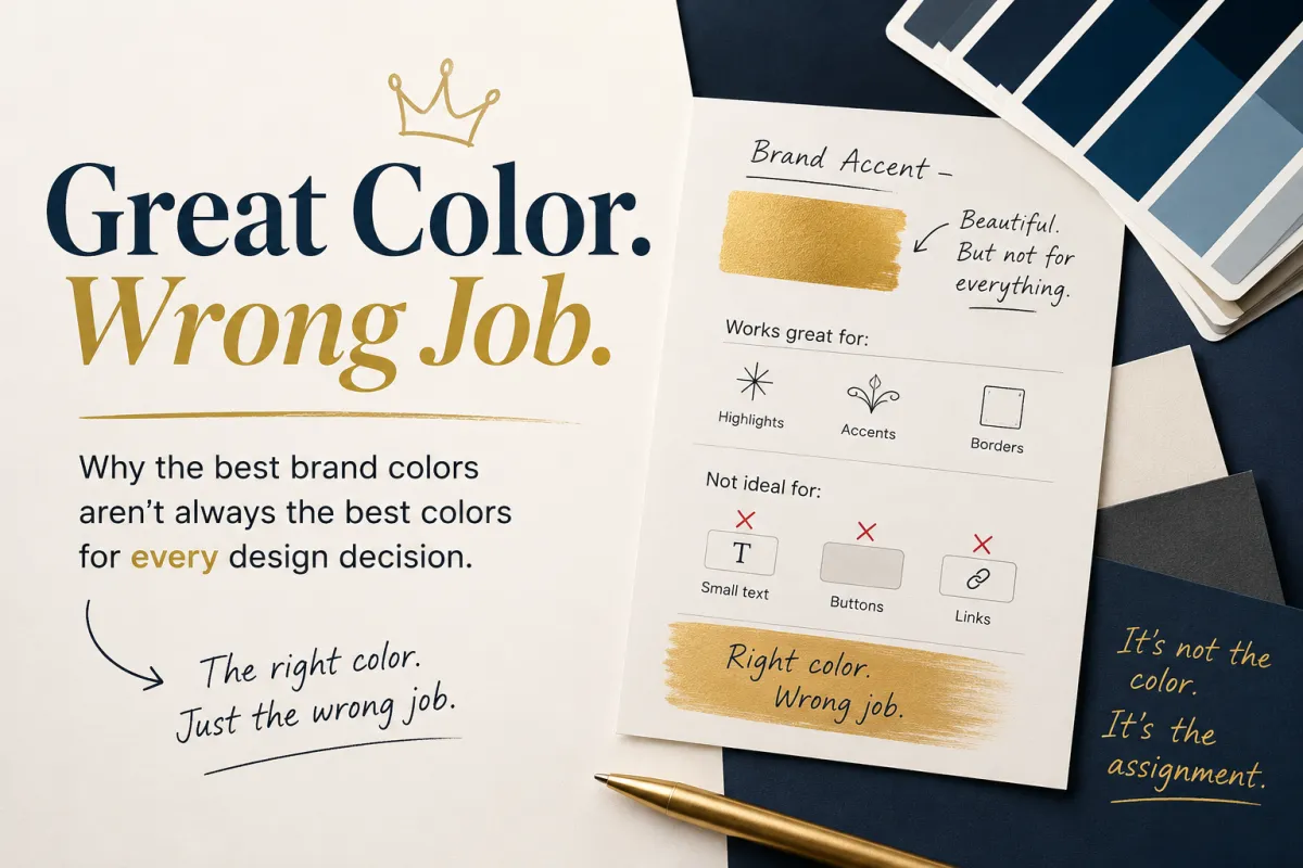
Great Color. Wrong Job. - Why the Best Brand Colors Aren’t Always the Best Colors for Every Design Decision
Great Color. Wrong Job.
Why the Best Brand Colors Aren’t Always the Best Colors for Every Design Decision
There’s a particular kind of design mistake that happens because everybody involved is trying to be consistent.
You have a brand palette.
Maybe it includes a beautiful navy, a warm ivory, a restrained gray, and this absolutely gorgeous gold that makes the whole thing feel expensive without looking like somebody wrapped the website in a casino carpet.
Everybody loves the gold.
It’s the Accent Color.
Then somebody builds the website.
“We should make the buttons gold.”
Makes sense.
“And the links.”
Okay.
“And maybe some of the smaller headings.”
Hmm.
“Ooh! What if we put gold text over the ivory background?”
Please stop hurting the gold.
There was nothing wrong with the color.
We just kept promoting it into jobs for which it was spectacularly unqualified.
And the more I’ve been thinking about brand color lately, the more I think this distinction gets missed.
Sometimes you don’t have the wrong color.
You have a great color doing the wrong job.
Colors Need Job Descriptions Too
Most Brand Boards give you something along the lines of:
Primary Color
Secondary Color
Accent Color
Then a handful of little squares and HEX codes.
Which is useful.
It’s also a little like hiring three people, giving them name badges, and neglecting to tell anybody what they actually do around here.
What does “Primary” mean?
Is it the most frequently used color?
The most recognizable one?
The website background?
The button?
What exactly does an Accent Color accent?
And apparently somewhere along the way we decided:
Accent Color = Button Color.
It doesn’t.
Sometimes your accent makes a fantastic button.
Sometimes it makes a fantastic border, icon, highlight, decorative flourish, or little moment of visual energy—and a truly terrible button.
That’s okay.
A color doesn’t have to be good at everything to deserve a place in your brand.
The Button Has a Job Too
Buttons are particularly good at exposing this problem because buttons have responsibilities.
They need to attract enough attention to be noticed.
They need to look interactive.
Their text needs to be easy to read.
They need to work against whatever background they happen to be sitting on.
And ideally they should accomplish all of this without screaming so loudly that every other element on the page packs its bags and leaves.
So if your beautiful pale gold Accent Color produces a weak button against your warm ivory background, you don’t have to keep forcing the relationship because:
“BUT GOLD IS OUR ACCENT COLOR.”
Maybe your navy makes the better button there.
Maybe your Secondary Color does.
Maybe gold remains the little visual reward that makes the composition feel like your brand.
Usability trumps forcing a color into a job it can’t perform.
There’s no demotion involved.
Gold can keep the corner office.
We’re just taking away its button privileges.
Then There’s the Background
This has become particularly interesting as website design has gotten more adventurous with backgrounds.
For years, the basic rhythm of an enormous number of websites was something like:
White.
White.
White.
Slightly different white.
Gray section.
White.
Dark footer.
And there’s nothing inherently wrong with that.
But look around contemporary web design and you’ll increasingly see backgrounds participating much more actively in the composition.
A page might move from a bright open section into something dark and dramatic, return to light, move through a muted surface for cards or features, hit a section filled with a brand color, then go dark again.
The background isn’t merely empty space behind the design anymore.
It is part of the design.
Which creates a wonderfully inconvenient problem.
Every time you choose a background color, you’ve also chosen a question:
What gets to live on top of it?
Your navy might be gorgeous.
Your ivory might be gorgeous.
Your blue might be gorgeous.
Your gold might be gorgeous.
That does not mean every possible combination of those four colors is gorgeous.
Or readable.
Or useful.
Suddenly the interesting thing about the palette isn’t just the colors.
It’s the relationships between them.
The HEX Codes Tell Me What You Have. The Relationships Tell Me What You Can Do.
Imagine I hand you this fictional brand palette:
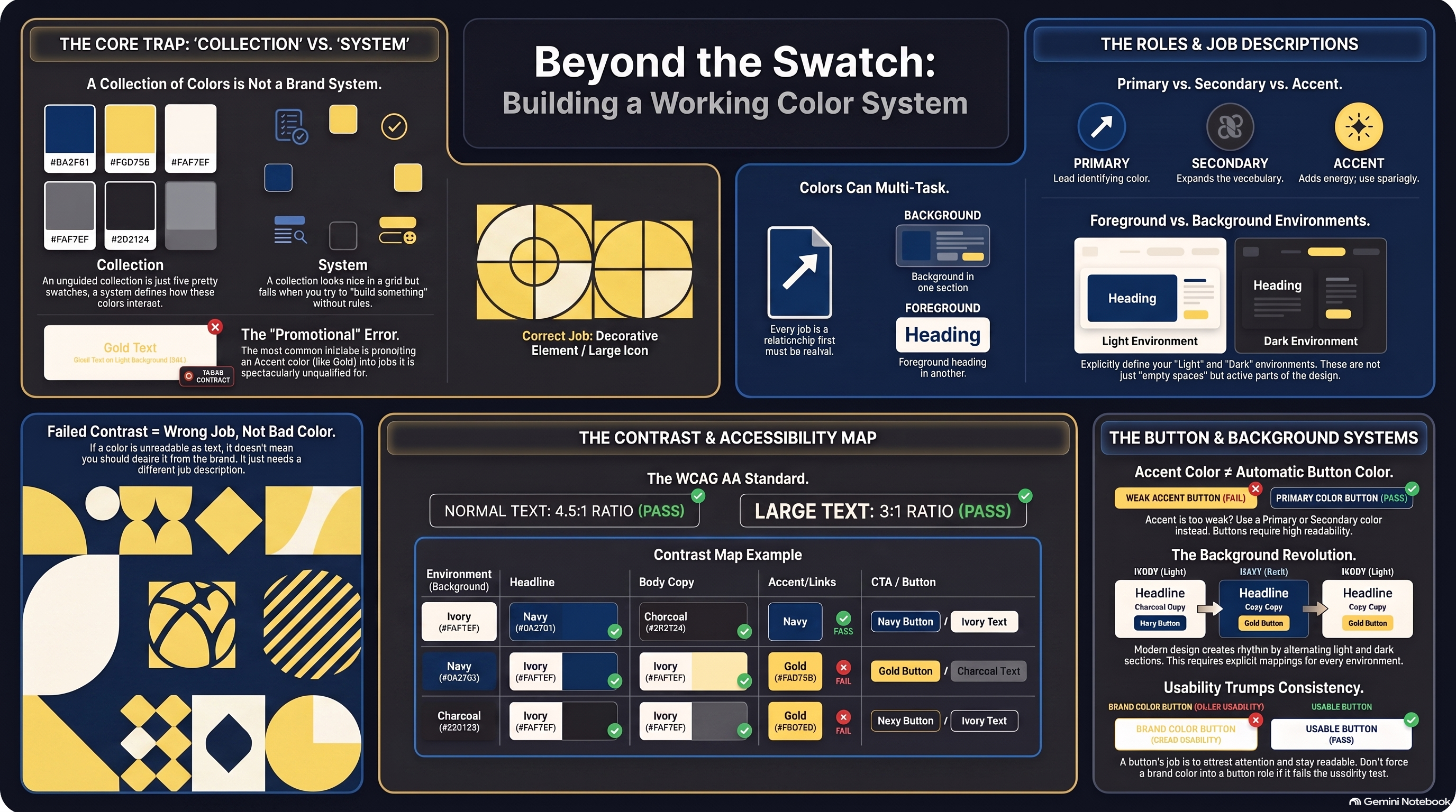
Navy — #0A2F61
Gold — #F6D75B
Ivory — #FAF7EF
Charcoal — #202124
There.
Branding complete!
Except it isn’t.
What I really want to know is:
What goes over Navy?
What goes over Ivory?
Can Gold carry text over either?
Which color makes the best button on the light background?
Does that same button treatment work in the dark section?
Can Navy become both a major identity color and a background?
Can Charcoal carry body copy while Navy handles headings?
Now we’re learning something useful.
Because a mature color system might eventually tell us:
Ivory Background → Navy Headlines → Charcoal Body Copy
Navy Background → Ivory Headlines → Light Body Copy → Gold Accents
Gold → Emphasis and Decorative Treatment, Not Small Text
Those instructions are arguably more useful to the next designer than the original list of HEX codes.
The colors tell us what ingredients are in the kitchen.
The relationships start giving us the recipes.
Sometimes We Can Stop Arguing About It
Design is full of subjective decisions.
That’s part of what makes it interesting.
But occasionally we get to measure something.
Color contrast is one of those occasions.
The Web Content Accessibility Guidelines—usually shortened to WCAG—give designers measurable ways to evaluate whether foreground and background colors provide enough contrast for people to distinguish important content.
There are different levels and standards involved, and you can travel surprisingly far down that particular rabbit hole.
But the principle is wonderfully simple.
That gorgeous pale color might look fantastic against white.
That does not necessarily mean it can carry small white text.
And when the contrast fails, our conclusion doesn’t have to be:
BAD COLOR.
It can simply be:
Great color. Wrong job.
Keep it in the palette.
Use it somewhere it can succeed.
Color Shouldn’t Have to Explain Everything Either
Accessibility introduces another useful design principle.
Not everybody perceives color in exactly the same way.
Various forms of color vision deficiency can make certain colors harder to distinguish from one another.
Which means an interface probably shouldn’t communicate something important only through color.
If a form field turns red when there’s an error, add an icon or message.
If green means success and red means failure, don't make the user infer the result solely from which colored dot appeared.
If a chart contains critical information, give people more than subtle color differences to decode it.
Color is excellent at reinforcing meaning.
It doesn’t always need the responsibility of carrying meaning by itself.
There it is again.
Right color. Right job.
More Colors Aren’t Necessarily More Flexible
This is where the temptation usually arrives.
If four colors aren't solving every design situation, perhaps we need eight.
Then twelve.
Then sixteen.
Soon the Brand Board looks like the wall at the paint department.
But adding another color every time a new design problem appears doesn't necessarily make a brand more flexible.
Sometimes it just makes it less recognizable.
The better question is:
Can the colors we already have solve this through a different relationship?
Maybe the Primary Color can do double duty.
Maybe the light foreground and light background can be the same color.
Maybe the Accent doesn't need to solve this problem at all.
And sure, sometimes another color really is necessary.
Great.
Give it a job.
If nobody can explain what recurring problem that new color solves, it might not need an employee badge yet.
A Palette Is More Interesting When It Becomes a System
This has changed the way I think about brand colors.
I still love a beautiful palette.
Of course I do.
Put five gorgeous swatches together and my designer brain is perfectly capable of staring at them approvingly while accomplishing absolutely nothing.
But the real test begins when those colors leave the swatch card.
Put the typography on them.
Build the hero.
Build the button.
Make the card.
Alternate the backgrounds.
Try the form.
Put the thing on a phone.
Ask what happens when this color has to carry information instead of merely looking pretty.
That's when you discover whether you've chosen a collection of attractive colors or built something capable of supporting an actual brand.
And the next time one of your brand colors isn't working, don't immediately ask whether you chose the wrong color.
Ask whether you gave it the wrong job.
Your brand doesn't need every color to be equally useful everywhere.
It needs a small group of colors that know when to lead, when to support, when to speak—and occasionally when to sit quietly in the corner looking ridiculously pretty.
That's not just a palette.
That's a color system.