The Button That Ate My Business
The Button That Ate My Business
There comes a moment in almost every entrepreneur's journey when they discover the magical power of a button.
It's a wonderful little invention. You put something on a webpage, add a button underneath it, and suddenly people can do things. They can book appointments, download guides, sign up for newsletters, purchase products, or ask for more information.
For a while, it feels like you've unlocked the secrets of the digital universe.
Then a customer asks a perfectly reasonable question.
"Can I get two of those, but in different sizes, and have one delivered to my office while I pick up the other on Friday?"
And suddenly your magical button is looking a little nervous.
The Customer Doesn't Care About Your Checkout System
I once heard a useful way of thinking about technology: people don't really want the tool. They want the thing the tool helps them accomplish.
Nobody wakes up excited to experience a beautifully configured payment processor.
They want the brisket delivered for Saturday's party. The guide that helps them solve a problem. The appointment that gets them closer to an answer. The course that teaches them something they've been struggling to learn.
They have a destination in mind.
And somewhere between discovering what you offer and actually obtaining it, you've placed a doorway.
Sometimes that doorway is a simple purchase button. Sometimes it's a booking calendar, an application, a shopping cart, or a conversation with someone who can prepare a quote.
The mistake is assuming that every doorway should look the same.
Imagine walking into a restaurant where ordering a cheeseburger requires completing a twelve-page application, watching a forty-minute presentation, and scheduling a consultation with the chef.
Now imagine ordering a custom wedding cake from a website that offers nothing but a button labeled BUY NOW.
Neither experience is particularly reassuring.
The problem isn't that one uses too much technology and the other uses too little. It's that neither was designed around what the customer actually needs.
Somewhere Along the Way, We Started Designing for the Software
It's easy to understand how this happens.
You open your website builder and discover an impressive collection of possibilities. There are forms, popups, checkout pages, payment links, shopping carts, booking calendars, automations, and integrations.
Every feature promises another opportunity.
So you begin asking which feature you should use.
It’s a reasonable question, but it’s rarely the right place to start.
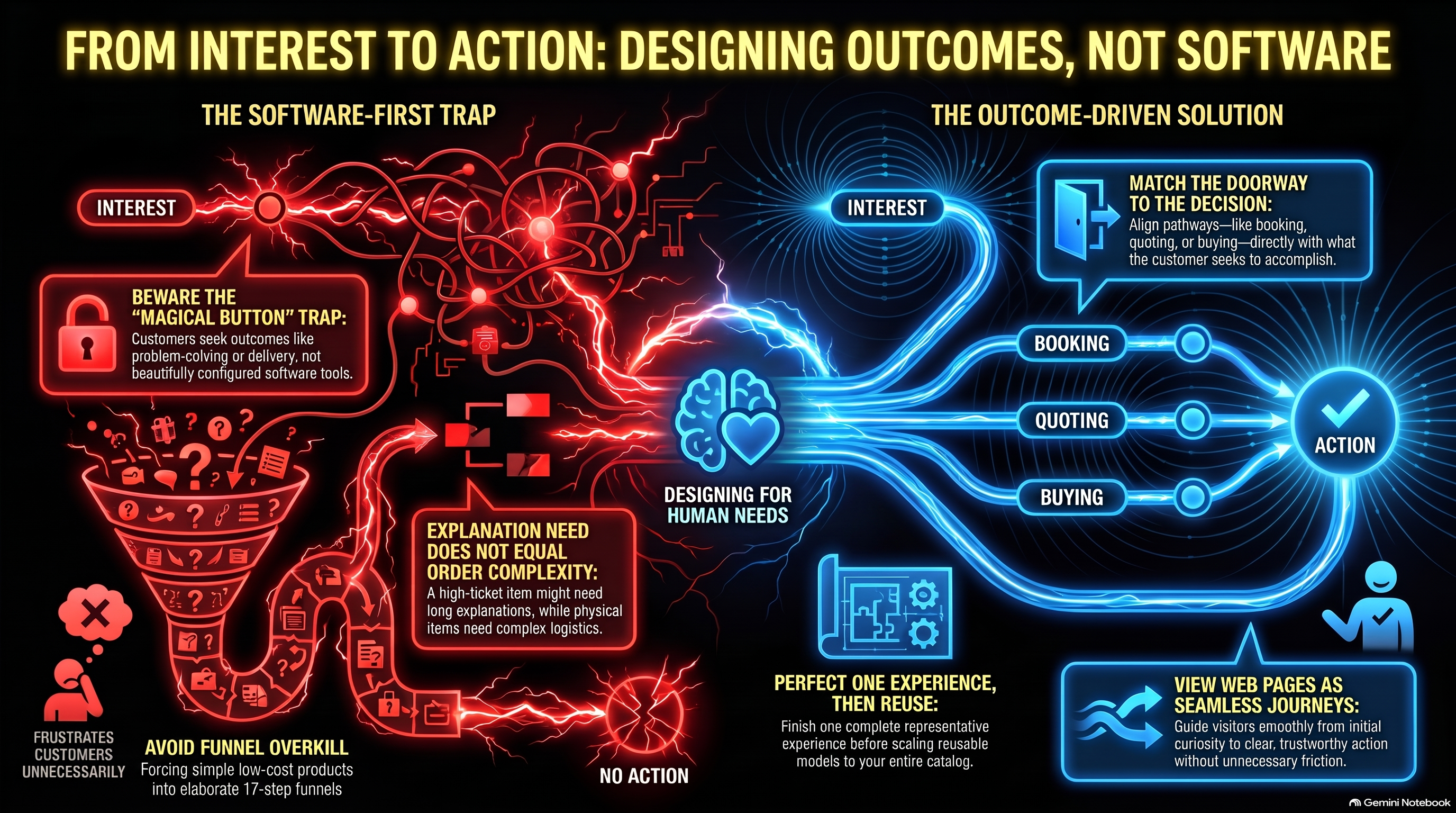
Before deciding whether your customer needs a cart, a form, or a payment link, you need to understand what they're trying to accomplish.
Do they already know what they want?
Do they need to choose between several options?
Does the price depend on information they haven't provided yet?
Are they buying something immediately, or beginning a conversation that might eventually lead to a purchase?
What happens after they take action?
These questions are considerably less glamorous than choosing the perfect checkout widget. They're also far more likely to prevent you from building something that makes perfect sense to your software and absolutely none to your customers.
A Five-Dollar Guide and a Five-Thousand-Dollar Service Walk Into a Website
Let's imagine two offerings.
The first is a downloadable guide that costs five dollars. The customer can read a short description, see what they'll receive, decide whether it's useful, and make a purchase.
Simple enough.
Now consider a five-thousand-dollar consulting engagement.
The customer may want to understand your experience, your process, what's included, what isn't, how long the engagement lasts, and whether you're a good fit for their particular circumstances.
They might need a conversation before they're ready to commit.
Both offerings could technically lead to a payment.
But treating them as identical purchasing decisions would be a strange choice.
And here's where things become even more interesting: the complexity of the decision isn't necessarily the complexity of the transaction.
That five-thousand-dollar engagement might require a lengthy explanation but only a simple invoice once the agreement is settled.
Meanwhile, a relatively inexpensive physical product could involve dimensions, colors, quantities, pickup arrangements, delivery zones, and shipping requirements that make its ordering process considerably more complicated.
The price tag doesn't tell the whole story.
Neither does the size of the sales page.
How much explanation someone needs and how complicated their order is are two separate questions.
Understanding that distinction can save a business owner an astonishing amount of unnecessary work.
Enter Henderson, Lord of the Checkout
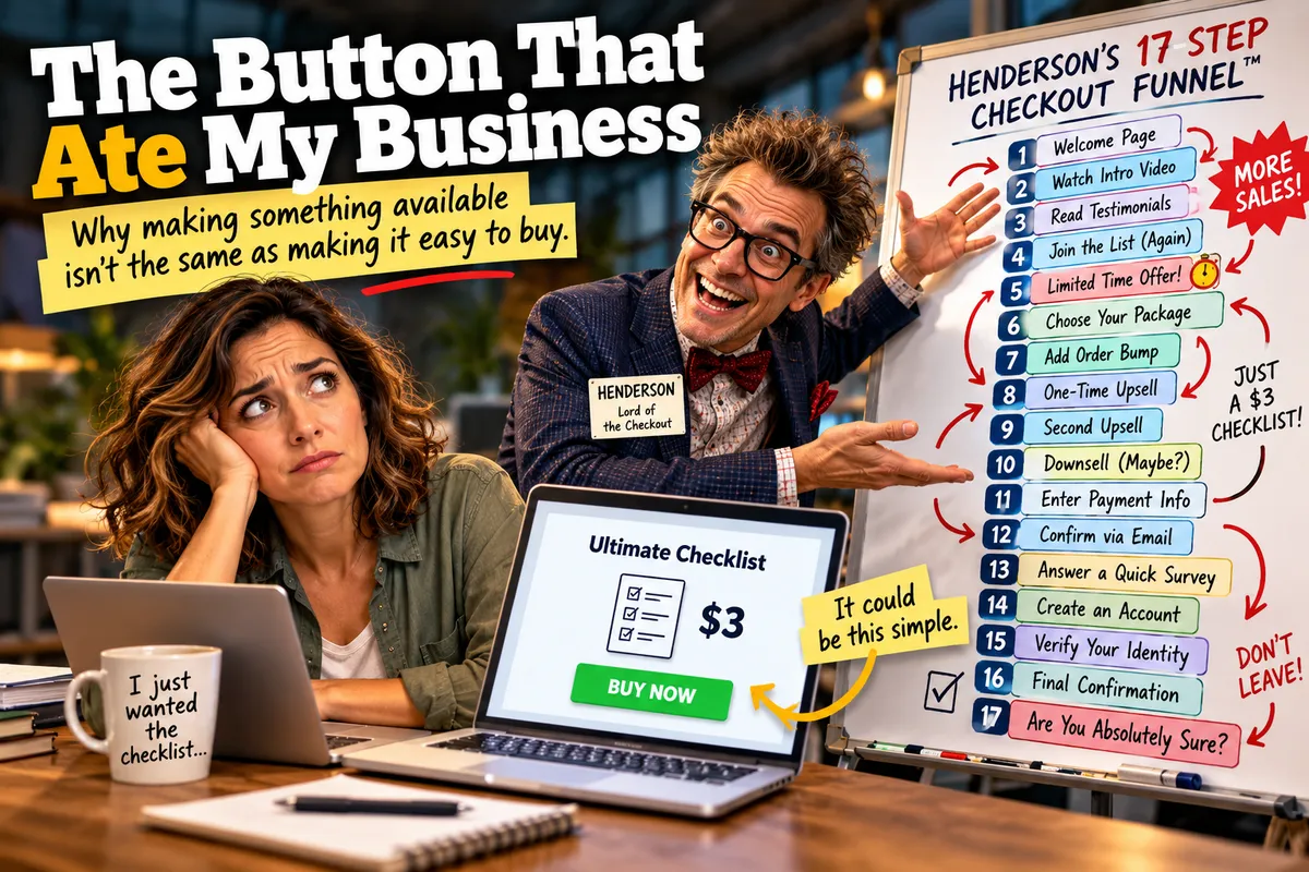
Enter Henderson, our occasionally overenthusiastic imaginary marketing consultant, armed with a different philosophy.
"Every offering needs a full sales funnel," he announces, gesturing toward a whiteboard covered in arrows.
He's designed a seventeen-step purchasing experience for a three-dollar downloadable checklist. There are testimonials, countdown timers, three upsells, two downsells, a limited-time bonus, and a popup that asks visitors whether they're absolutely certain they want to abandon their dreams.
The checklist itself contains six bullet points.
Henderson is currently developing a webinar to explain why nobody is buying it.
The trouble with this approach isn't merely that it's excessive. It's that we've allowed the machinery of marketing to become more important than the customer's original purpose.
Sometimes a person just wants the checklist.
Let them have the checklist.
And if someone needs a thoughtful conversation before investing in a complex service, give them a clear way to begin that conversation.
Good customer experiences don't have to be elaborate.
They have to make sense.
The Complicated Stuff Is Still Complicated
Of course, some businesses have genuinely difficult ordering requirements.
Maybe you sell products whose shipping costs depend on distance, size, weight, or special handling. Maybe customers can choose delivery or pickup, but only certain options are available in certain locations.
Perhaps a custom order needs someone on your team to review the specifications before confirming a price.
You can't solve those problems simply by declaring that the customer experience should be easy.
But you can make the thinking easier.
Instead of beginning with a technical question such as "How do I program all these conditions into my checkout?", begin by describing what needs to happen.
What choices does the customer make? Which choices affect the price? What information does your team need? Who approves the order? When should the customer expect a response?
Once those requirements are clear, you can evaluate which tools can actually support them.
Sometimes the answer will be a straightforward configuration. Sometimes it will involve specialized software, an integration, or a more personal ordering process.
And sometimes the right answer is simply, "We need to investigate that before promising it."
There's nothing wrong with that.
In fact, knowing what you haven't solved yet is often one of the most valuable outcomes of planning.
One Good Example Can Teach You More Than Fifty Empty Templates
There's another trap waiting for entrepreneurs who have large catalogs of offerings.
Once you realize every offering needs a clear customer experience, it's tempting to create an enormous worksheet and start filling out the same information for every product.
Thirty products? Thirty worksheets.
Three hundred products? Well, cancel your weekend.
But many offerings share the same basic journey.
If twenty products use the same pricing approach, require similar selections, and follow the same fulfillment process, you probably don't need to design twenty completely different purchasing experiences.
You need one useful model and a way to record the meaningful differences.
And before attempting to tackle an entire catalog, it helps to finish one example.
Choose an offering. Understand the customer's decision. Explain what they'll receive. Clarify the next action. Address the important questions.
Make that one experience genuinely useful.
Then let what you've learned guide the others.
That's how a complicated project becomes a collection of manageable decisions rather than an enormous pile of unfinished possibilities.
The Button Was Never the Important Part
There's a quiet shift that happens when you stop thinking about your website as a collection of pages and buttons.
You begin seeing it as a series of experiences.
Someone arrives with a question, a problem, a desire, or a goal. They discover something you offer that might help. They try to understand whether it's right for them.
Then they need a sensible way to move forward.
Your job isn't to impress them with the sophistication of your software.
It's to make that next step clear, appropriate, and trustworthy.
Sometimes the right answer really is a single button.
Sometimes it's a thoughtful explanation followed by an invitation to talk.
And sometimes it's an ordering system that deserves considerably more planning than anyone originally expected.
The good news is that you don't need to know how to build every possible system before you can understand what your customers need.
That exact distinction is what we unpack in Packet 045 of the Business Brain Builder: From Interest to Action.
We begin with one offering, develop a complete customer-facing presentation, and create reusable blueprints for the rest. The technical implementation comes later, through the Powerful Progress Program, when we know what we're actually trying to accomplish.
Because the goal was never to build a better button.
It was to help the person on the other side of it get where they wanted to go.