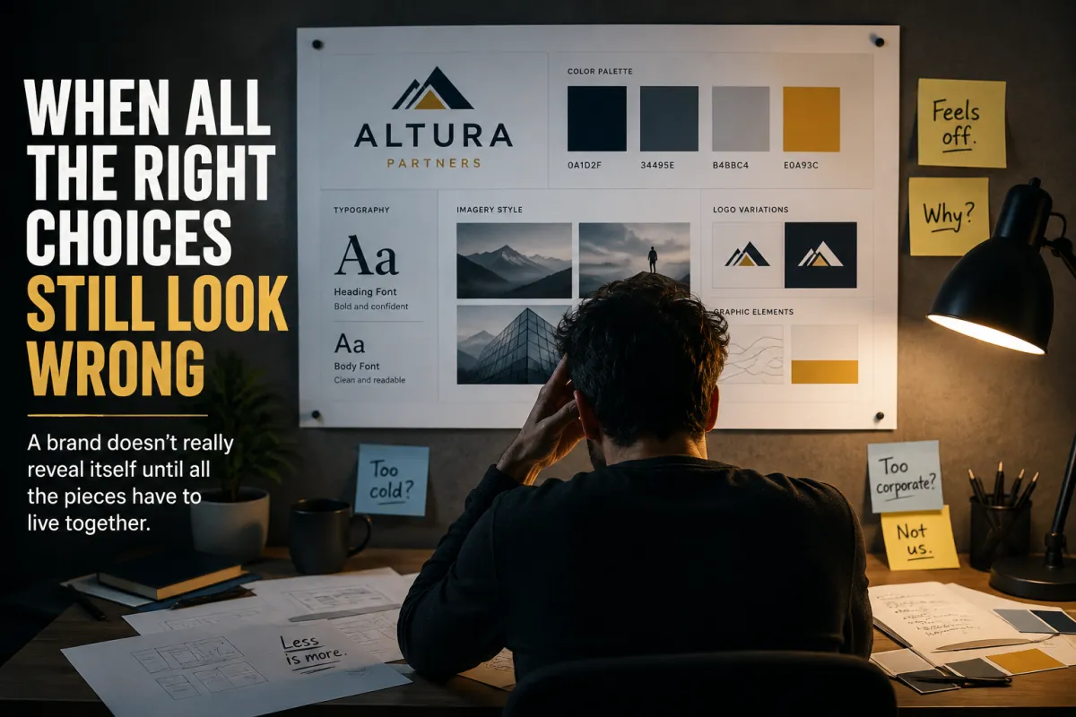
When All the Right Choices Still Look Wrong - A brand doesn't really reveal itself until all the pieces have to live together
When All the Right Choices Still Look Wrong
A brand doesn't really reveal itself until all the pieces have to live together.
There is a strange moment in building a visual identity when you can be reasonably happy with every decision you've made and still not know whether any of it actually works.
You like the logo.
The colors make sense.
You've found fonts that feel right. The imagery seems appropriate. Even the general visual style has started to take shape.
Taken one at a time, every decision can earn a perfectly respectable thumbs-up.
Then you put everything on the same page.
And your stomach sinks a little.
Nothing is obviously bad. That's what makes the feeling so hard to place. The logo still looks good. The colors haven't mysteriously changed. The fonts are still the fonts you chose. Nobody snuck in overnight and replaced your photography.
Everything is following the rules.
Yet you find yourself staring at the whole thing with that uncomfortable little wrinkle in your forehead because somehow it doesn't feel like the business you thought you were building.
And then comes the nastier possibility.
Maybe the problem is me.
Maybe I don't actually know what I'm doing. Maybe all those individual decisions only seemed good because I never had to see them standing beside one another before.
That's an uncomfortable place to sit.
But I'm beginning to think some version of that uncertainty is simply the price of admission for creative work. If you're making something whose answer wasn't completely known before you started, eventually you're going to reach a point where your judgment has to meet reality.
That's when branding gets interesting.
──────── ⚡ ────────
I think we naturally assume that if we make enough good individual decisions, the finished result should take care of itself.
It sounds reasonable.
Choose a good logo.
Choose a good palette.
Choose good typography.
Choose good imagery.
Stack the good decisions on top of one another and eventually a good brand should pop out the other end.
Except visual systems don't really work that way.
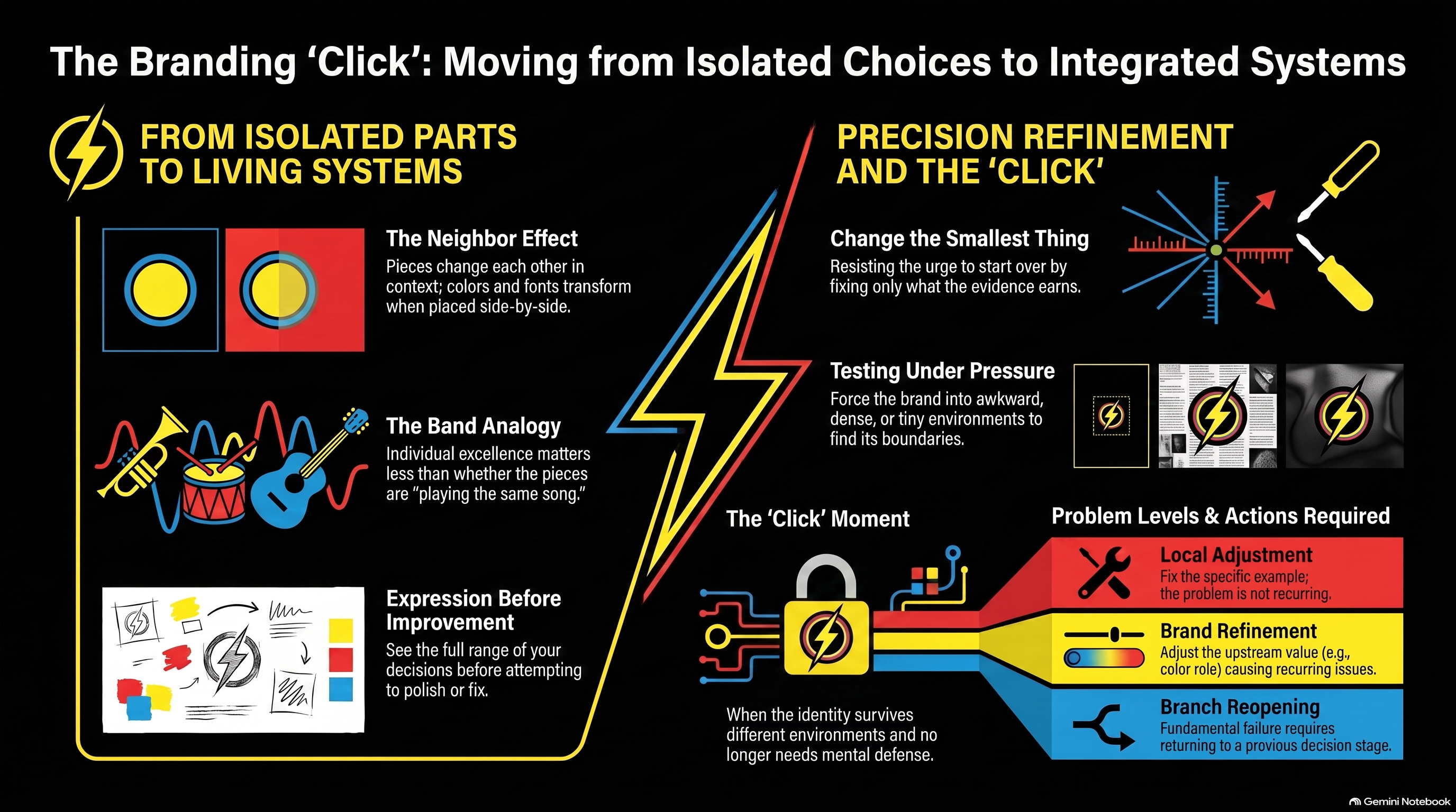
The pieces change each other.
A color that looked restrained on a swatch can become overwhelming when it occupies half a page. A headline font that looked fantastic in three words can become exhausting when it's asked to carry twelve. A logo you loved against white can suddenly feel timid once the photography around it becomes more expressive.
An image treatment that seemed distinctive on its own might start making everything feel like it came from the same Instagram filter.
None of those choices necessarily became bad.
They finally got neighbors.
──────── ⚡ ────────
This is one of the reasons I've become increasingly suspicious of making branding decisions entirely from isolated samples.
A color palette is useful. A font pairing is useful. A logo presentation is useful.
But they're a little like meeting the members of a band one at a time and deciding whether the band is any good.
Lovely drummer.
Excellent guitarist.
Singer seems capable.
I'm feeling optimistic.
Eventually somebody has to count to four.
And that's when you discover whether you've got a band or three talented people playing different songs.
Maybe the drummer is pushing everything forward while the guitarist keeps dragging it back. Maybe the singer is fighting for space that isn't there. Maybe everybody is technically playing well and somehow all you can hear is feedback.
Then, occasionally, it locks.
The rhythm leaves room for the melody. The bass is doing something you barely notice until somebody takes it away. Nobody has to fight to be heard because the pieces have figured out where they belong.
Visual identity can feel surprisingly similar.
The relationship between the pieces is where the brand actually begins to emerge.
And sometimes that's also where you discover that one perfectly good decision needs to change.
──────── ⚡ ────────
The temptation at that point is to start over.
Maybe the logo was wrong.
Maybe we picked the wrong colors.
Maybe we should find another font.
Maybe we need an entirely different visual direction.
Maybe we should burn the Brand Board and flee the country.
Usually, that's an overreaction.
It's also understandable. You've spent all this time making careful decisions, finally put them together expecting the satisfying reveal, and instead you're sitting there thinking, Oh no. What did I do?
That's not exactly the emotional state in which human beings are famous for making restrained decisions.
If nineteen examples feel right and one doesn't, you probably don't have a brand problem.
You have an example problem.
If the same discomfort keeps appearing in different places, though, now you've learned something.
Maybe the accent color needs a smaller role. Maybe the typography needs more breathing room. Maybe the imagery needs to feel a little warmer.
That's different.
The useful question isn't:
“Do I still like my brand?”
It's:
“What, specifically, isn't working here?”
And then:
“Is it happening anywhere else?”
Those two questions can save an extraordinary amount of unnecessary redesign.
──────── ⚡ ────────
There's another reason this matters now that AI can produce visual concepts so quickly.
We can finally see a lot more consequences before committing to them.
Instead of choosing a palette and hoping it'll behave when the website eventually gets built, we can put it to work now.
Show me the light version.
Show me the dark version.
Put the typography under pressure.
Give me something sparse.
Now something dense.
Show me the brand on a landing page.
Show me an advertisement.
Show me something tiny.
Put everything together.
Now make the conditions awkward.
Not very long ago, a lot of that exploration required time, production work or money. So we made the best decisions we could and carried a certain amount of uncertainty forward with them.
Now we can turn some of that uncertainty into something we can actually look at.
And I've started thinking that this may be one of AI's more interesting creative roles.
It can be a sparring partner.
Not because it knows the answer, but because it can throw your own ideas back at you quickly enough that you finally have something concrete to argue with.
“No, that's too polished.”
“That color is doing way more work than I intended.”
“I thought I wanted bold. Apparently I meant confident.”
“Why do I love this one and hate that one when they're using exactly the same ingredients?”
Those reactions move the thinking forward.
AI doesn't have to settle the argument. Sometimes its most useful contribution is giving you something worth arguing about.
We can try something, look at it, react to it and try again. The decision doesn't have to carry the weight of eternity anymore; it has to be good enough to test.
There's a peculiar kind of relief in that.
──────── ⚡ ────────
That's the part I find most interesting.
The finished visual system doesn't simply come from making decisions. It comes from experiencing the consequences of those decisions together, noticing what repeatedly feels right or wrong, and becoming just a little more precise each time about why.
Then comes a quieter part of the craft: resisting the urge to fix more than you've actually learned.
That's harder than it sounds.
Starting over feels decisive. Changing everything gives you the emotional satisfaction of doing something. But once you've generated enough evidence to know that nineteen things are working and one isn't, throwing away all twenty isn't creativity.
It's panic with a mood board.
The more disciplined move is usually smaller.
Change the smallest thing the evidence earns.
You don't replace the whole palette because one graphic is ugly. You don't redesign the logo because somebody made it too small. And you don't throw away months of good thinking because one AI generation decided your professional services company apparently needed to become a cyberpunk nightclub.
You look for the recurring signal.
If the problem belongs to the example, fix the example.
If the example teaches you something about the brand, fix the brand.
Then look again.
──────── ⚡ ────────
And eventually, after enough looking and adjusting, there's a very different moment from the sinking-stomach one that started all of this.
The pieces begin to click.
Not because every composition looks identical or because you've finally written enough rules to prevent anything unexpected from happening. Quite the opposite. You start seeing the same identity survive different layouts, different applications, different amounts of information and different visual environments, and there's a strange little relief in realizing that you no longer have to keep convincing yourself these choices belong together.
You can see it.
The logo feels at home.
The typography knows its role.
The colors stop competing for attention.
The imagery belongs in the same world.
Nothing is trying quite so hard anymore.
And maybe you're not either.
You aren't mentally defending the logo anymore or wondering whether you chose the wrong blue. You're not trying to convince yourself that the pieces belong together.
You can finally just look at them.
There it is.
That's us.
There's a peculiar relief in that click—not because every uncertainty has disappeared, but because this version has earned enough confidence to become the place you build from.
And perhaps that's when a brand becomes much more than a collection of choices.
It's when those choices finally learn how to live together.