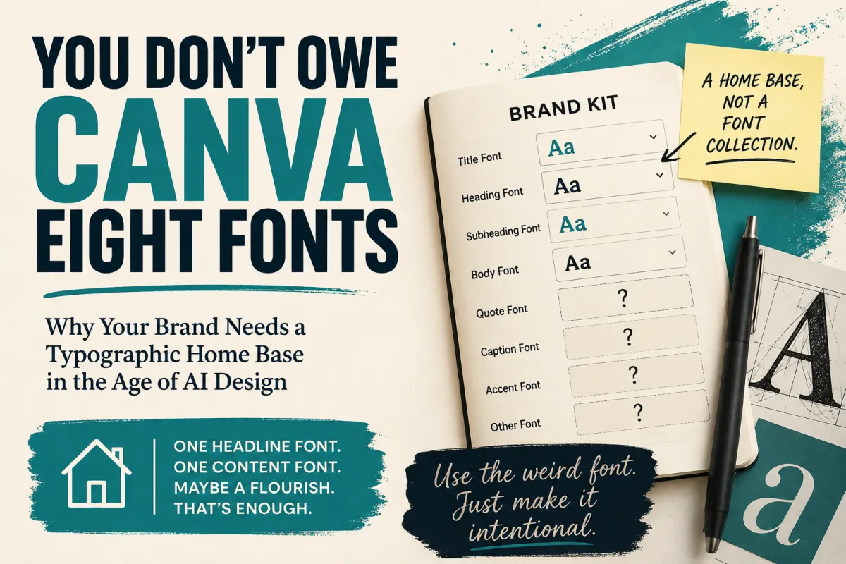
You Don't Owe Canva Eight Fonts - Why Your Brand Needs a Typographic Home Base in the Age of AI Design
You Don't Owe Canva Eight Fonts
Why Your Brand Needs a Typographic Home Base in the Age of AI Design
Open a Brand Kit sometime and typography can get intimidating surprisingly fast.
Title.
Heading.
Subheading.
Body.
Quote.
Caption.
Maybe another heading level for good measure.
Somewhere around the sixth empty box, you can start wondering whether professional branding requires a different typeface for every emotional state your company might someday experience.
It doesn't.
And lately I've found myself thinking about this more than usual, because something strange is happening in design.
AI is getting really good at breaking the rules.
Sometimes annoyingly good.
──────── ⚡ ────────
Wait. I Thought We Weren't Supposed to Do That.
I've done design work long enough to have experienced a familiar conversation.
You find an interesting typeface. Maybe it's slightly unusual. Maybe it's decorative. Maybe there's a gorgeous script treatment that sacrifices just a little immediate readability in exchange for personality.
You put it into the design.
The client looks at it.
“Is that hard to read?”
Well... slightly.
That's kind of the point.
We're not setting the warranty agreement in it. It's three words, they're enormous, and the rest of the sentence practically tells you what they say.
But now we're discussing readability.
So the flourish disappears.
The unusual font gets replaced.
Something safer takes its place.
Designers have been having versions of that conversation forever.
Then AI-generated design showed up and apparently nobody told it about the meeting.
Suddenly I'm seeing designs with enormous decorative script dropped directly into headlines. Words twist around photographs. Type changes size, weight, style and sometimes entire families inside the same composition.
And people look at the result and say:
“Wow. That's cool.”
Wait a minute.
You let the robot do it?
😂
──────── ⚡ ────────
Maybe AI Isn't Better at Following the Rules
I started wondering why these choices seem easier to accept when they arrive inside a completed AI-generated design.
I don't think the answer is simply that people trust AI more than human designers.
Something subtler may be happening.
When a human designer discusses an individual choice with a client, the choice itself becomes the subject of the conversation.
Should that font be there?
Should that word be script?
Is it readable enough?
Could we make it bigger?
What if we tried this other font?
The moment the decision becomes visible, it becomes negotiable.
A generative design system often skips that conversation entirely.
It doesn't ask permission to put those three words in a ridiculous swirly typeface.
It just shows you the composition.
Now you're not evaluating the ingredient.
You're experiencing the finished dish.
And that's a very different psychological task.
──────── ⚡ ────────
AI Has Another Unfair Advantage
Speed.
A human designer can absolutely build an elaborate composition using six different typefaces.
But every one of those choices takes time.
Search.
Compare.
Try it.
No.
Try another.
Adjust the weight.
Change the size.
Move it.
Stare at the screen.
Wonder whether you've lost all objectivity after looking at fonts for 45 minutes.
Get coffee.
Come back.
Decide the first one was better.
A generative system can make an absurd number of those tiny compositional decisions almost instantly.
That changes what's practical.
It can effectively decide:
This particular line, in this particular position, inside this particular composition, needs this particular typographic personality.
And sometimes it works beautifully.
That doesn't mean the old branding rules suddenly became useless.
In fact, I think AI design may be making one of them more important than ever.
──────── ⚡ ────────
A Great Composition Isn't Necessarily a Brand
Here's the distinction I've been circling around:
Generative design can optimize the composition in front of it. Branding also has to optimize the relationship between that composition and the next hundred.
That's a different problem.
Imagine AI creates an incredible advertisement for your company using five typefaces.
Great.
Tomorrow it creates an equally incredible social graphic using four completely different ones.
Then a landing page.
Then an email graphic.
Then another advertisement.
Every piece might be individually attractive.
Put them all together and something strange can happen.
If every statement has a completely different typographic personality, eventually it starts to feel like every statement came from a different speaker.
That's where typography stops being merely decoration.
It's part of the voice.
And recognizable brands benefit from having a voice people can learn to recognize.
──────── ⚡ ────────
Your Brand Needs a Home Base
I've started thinking about brand typography less as a set of rules and more as a home base.
For most businesses, that can begin remarkably simply.
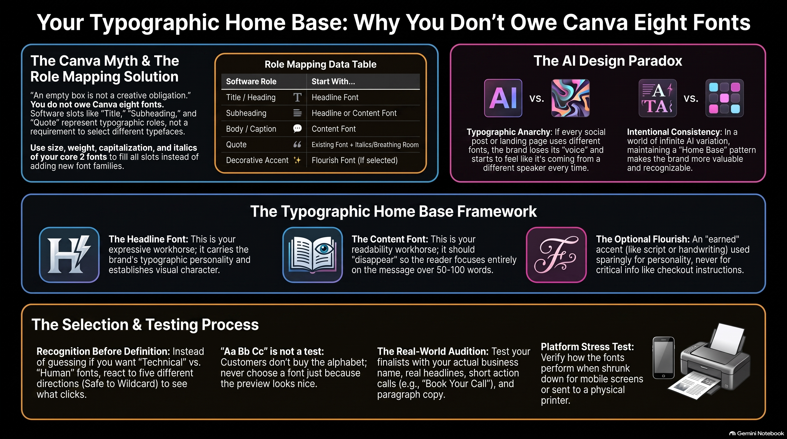
One Headline Font
This is the expressive workhorse.
It can carry more personality. It helps establish the visual character of the business.
One Content Font
This is the dependable one.
Its greatest accomplishment may be that somebody reads 800 words in it without thinking about the font once.
That's not boring.
That's doing its job extremely well.
Those two fonts give the business somewhere to return.
They don't mean you can never use another typeface again.
Your typography system isn't a prison. It's your brand's home base.
A designer can leave home.
An AI can leave home.
Sometimes they absolutely should.
But there's an enormous difference between deliberately breaking away from an established visual language and simply inventing a new one every Tuesday.
──────── ⚡ ────────
And About That Beautiful Swirly Script...
Here's another rule I think deserves a little more nuance.
We're seeing more expressive typography again—handwriting, decorative scripts, flourishes and other treatments that sometimes walk right up to the edge of conventional readability.
I love some of it.
And I don't think using it automatically means readability has been sacrificed on the altar of looking cool.
It depends on what job the typography is doing.
If the most important instructions on your checkout page are written in elaborate calligraphy, we have a problem.
If two enormous words inside an otherwise perfectly understandable headline take an extra half-second to decipher?
Maybe that's okay.
The surrounding message is carrying context. The decorative words are carrying personality.
That's a legitimate trade.
So I've increasingly come to like the idea of an optional third member of the typography system:
The Flourish Font
Not required.
Not your paragraph font.
Not something sprinkled onto every design like parsley.
An accent.
A few expressive words when the composition earns them.
And if your brand doesn't need it?
Don't use one.
Two great fonts beat three unnecessary ones every time.
──────── ⚡ ────────
What About the Quote Font?
This is another place software can accidentally make branding feel harder than it is.
If Canva gives you a box labeled:
QUOTE FONT
your immediate instinct may be:
Apparently I need a Quote Font.
Maybe you don't.
Try your Content Font in italics.
Try your Headline Font at another weight.
Increase the size.
Add breathing room.
Change the placement.
If you have a Flourish Font, perhaps a very short pull quote occasionally earns it.
The larger principle is simple:
A software slot is a typography role. It is not an instruction to choose another font.
An empty box isn't a creative obligation.
You do not owe Canva eight fonts.
──────── ⚡ ────────
So How Do You Choose the Two That Matter?
This question came up while I was working on the typography stage of the Business Brain Builder, and it led me somewhere I didn't entirely expect.
Normally, someone choosing fonts might start by scrolling through fonts.
That seems backward.
By this point in the Business Brain Builder process, we've already spent considerable time understanding the business, its customers, the progress those customers want, the owner's intentions, the Brand Voice, and the kind of business we're actually trying to build.
So instead of asking:
“Which font do you like?”
we can ask something much more interesting:
“Given everything we already know about this business, what typography directions might actually belong to it?”
Then let AI do what it's exceptionally good at:
Search a huge possibility space quickly.
Give me five directions.
Not five nearly identical “safe” answers.
Give me your strongest interpretation.
Give me some credible alternatives.
And give me one wildcard that stretches what we think we know without contradicting it.
Then the human does something AI can't know in advance:
React.
──────── ⚡ ────────
“I Don't Have a Clue” Is Useful Information
This may be my favorite part.
We have a bad habit in branding exercises of asking people to define things they don't yet know how to define.
Is your desired typography:
Traditional or Contemporary?
Technical or Human?
Refined or Approachable?
I don't know.
Show me something.
Maybe I don't know that I love slightly retro-futuristic typography until somebody puts it in front of me.
Maybe I can't tell you I want “editorial authority with a warm human counterbalance.”
Maybe what I can tell you is:
“THAT ONE. I don't know why yet, but THAT ONE.”
Great.
Now we have something to investigate.
That's why I've become increasingly fond of recognition before definition.
If you already know you want light sci-fi, deep woo, high fantasy, nautical nonsense, heroic comic-book energy or an 80s space-horror throwback, fantastic.
Say so.
If you don't?
Don't manufacture an answer to satisfy the worksheet.
Let yourself be surprised.
Then figure out why you reacted.
──────── ⚡ ────────
Make the Fonts Do the Job
Eventually, of course, the audition has to end.
And this is where I have one request:
Please don't choose your business typography because this looked nice:
Aa Bb Cc
Your customers aren't buying the alphabet.
Put your actual business name in it.
Put a real headline in it.
Put Book Your Call in it.
Put 100 words of actual paragraph copy in the Content Font.
Shrink it down to a phone.
Put it on a social graphic.
If your business prints things, print it.
The question isn't whether the font is beautiful in isolation.
The question is whether the system works where your business actually communicates.
That's how you get from:
“I like this font.”
to:
“This feels like us.”
──────── ⚡ ────────
The Rules Aren't Dead. They're Growing Up.
AI is going to keep changing design.
Some old rules will turn out to have been limitations of time, tools and production costs rather than eternal principles of visual communication.
Some conventions will loosen.
Some things designers used to avoid because they took too long may become commonplace simply because machines can execute them effortlessly.
I'm excited about that.
But I don't think the answer is typographic anarchy.
If anything, a world capable of generating infinite variation makes intentional consistency more valuable.
Use the weird font.
Add the flourish.
Let the AI surprise you.
Break the pattern when the design earns it.
Just make sure there's a pattern there to break.
Because your brand doesn't need eight fonts.
It needs a visual voice.
And every good voice deserves somewhere to call home.