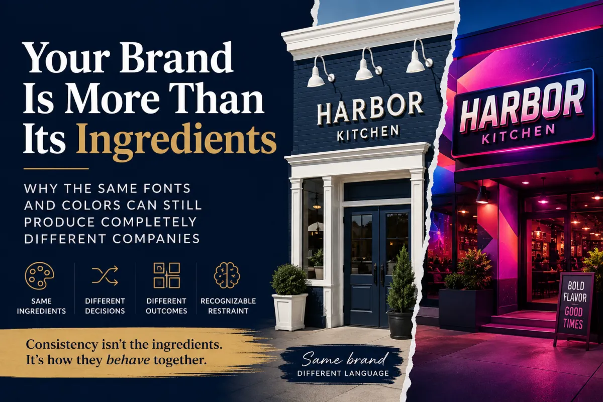
Your Brand Is More Than Its Ingredients - Why the Same Fonts and Colors Can Still Produce Completely Different Companies
Your Brand Is More Than Its Ingredients
Why the Same Fonts and Colors Can Still Produce Completely Different Companies
Yesterday my wife and I passed a new restaurant neither of us had tried before, and we both had essentially the same reaction:
Yeah, we should try that place.
Then we had to figure out why.
We hadn't eaten there. We hadn't checked the reviews or looked at the menu. There wasn't an enormous photograph of a steak making promises from thirty feet away. Nothing about the exterior, as far as I can remember, explicitly made the argument that the food inside was going to be good.
The branding wasn't especially loud either.
Navy blue. White trim. A fairly ordinary font. There was an interesting shadow treatment behind the lettering, using the same white already present in the design.
Nothing revolutionary.
And somehow, the whole thing worked.
It looked clean. New. Intentional. Self-respecting. Different enough to notice without looking desperate to be noticed.
What gave us pause was that neither of us could point to the one design decision responsible for our reaction.
Maybe that's because there wasn't one.
The choices simply agreed with each other.
And I think that's one of the things we miss when we talk about branding as a collection of ingredients.
The Brand Board Problem
Most of us are familiar with some version of a Brand Board.
Here's the logo.
Here are the colors.
Here are the fonts.
Maybe there are a few logo variations, some HEX codes and examples of what not to do. If somebody got particularly ambitious, there may even be a mood board showing the general vibe.
All useful stuff.
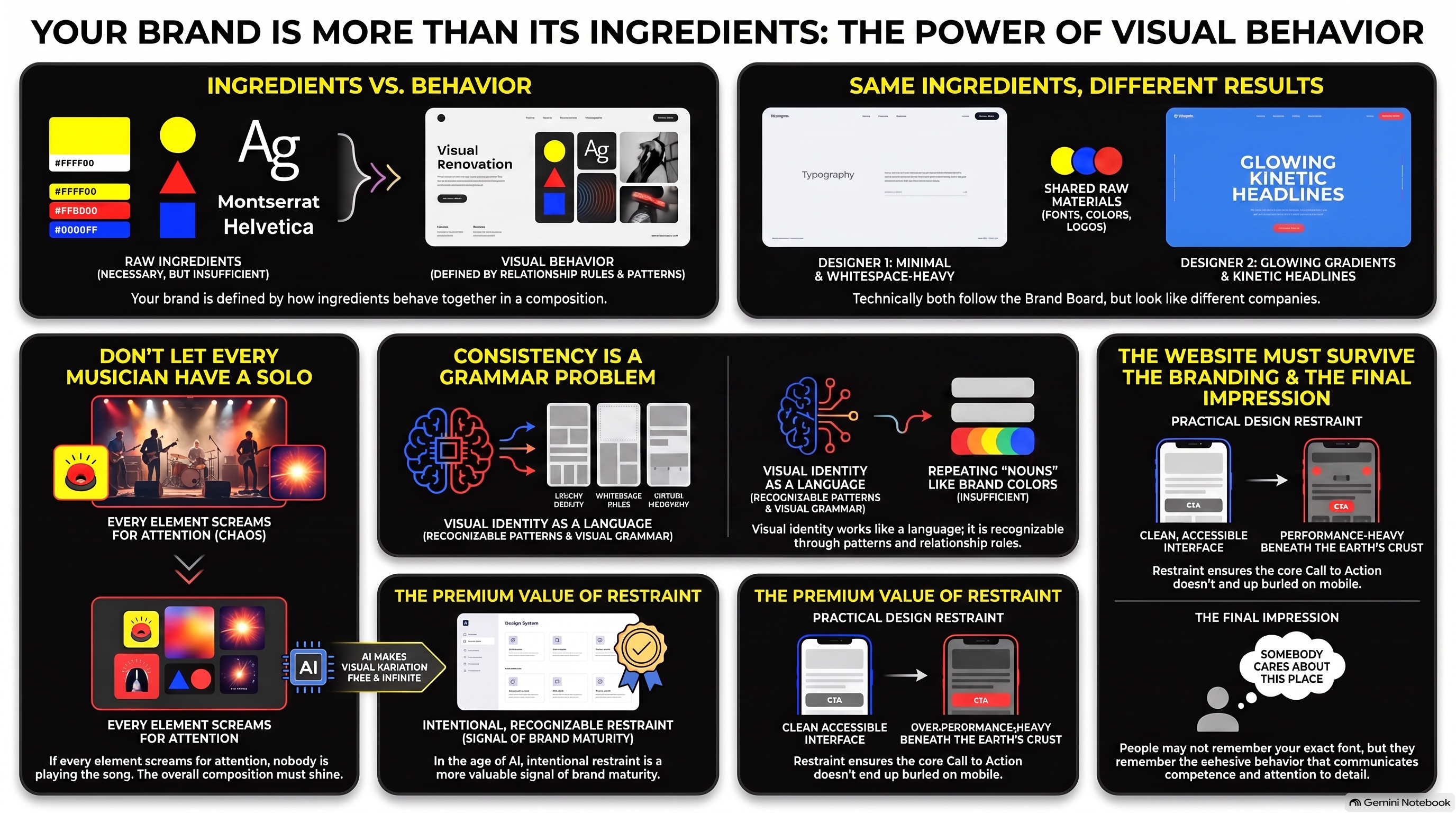
But give two competent designers the exact same logo, the same two fonts and the same five HEX codes, and they can still produce work that looks like it came from completely different companies.
One designer might use enormous candid photography, restrained typography, generous whitespace and almost no decorative effects.
Another might use those exact same fonts and colors with gradients, layered cards, glowing accents, hard shadows and kinetic headlines.
Neither necessarily violated the Brand Board.
That's the problem.
The ingredients tell us what we're working with. They don't necessarily tell us how those ingredients behave together.
And apparently, sometimes that's enough to make two people drive past a restaurant and independently decide they want dinner there.
Not Every Ingredient Needs Personality
I keep coming back to the font on that restaurant.
It wasn't particularly memorable.
If someone had shown it to me by itself and asked for an opinion, I doubt I would have said, “Now that's a restaurant font.”
But maybe it didn't need to be interesting.
The navy and white were already doing something. The shadow treatment added a small bit of distinction. The name itself worked. The whole presentation felt crisp and considered.
If the font had also been screaming for attention, maybe the result would have been worse.
That's a useful thing to remember in a design environment where we now have nearly unlimited ability to make every individual element interesting.
We can make the headline more dramatic.
Make the gradient more complex.
Give the photograph a cinematic treatment.
Add a texture.
Make the button glow.
Animate the text.
Give the card some depth.
Add another font because this particular sentence would look amazing in it.
Pretty soon every musician has a solo and nobody is playing the song.
Not every ingredient needs personality. The composition does.
Consistency Is a Grammar Problem
I've started thinking about visual identity less like a list of ingredients and more like a language.
A language isn't recognizable because it keeps using the same nouns. It becomes recognizable through patterns in how the pieces relate.
Visual identity works much the same way.
Maybe the photography tends to be candid rather than posed. Maybe people are shown doing things rather than staring into the camera.
Perhaps gradients appear, but they're subtle and usually doing a job—helping typography sit over an image, connecting two established colors, or guiding the eye through a composition.
Maybe cards use fine borders but almost no shadows.
Perhaps typography is given plenty of room and rarely shouted in all caps.
Maybe the brand uses lots of whitespace, but keeps related information close enough together that the page doesn't feel like its components are trying to avoid one another.
Motion might be almost invisible until you interact with something.
None of those decisions necessarily defines the brand by itself.
Repeat enough of them, though, and something starts to happen.
You begin recognizing how this company tends to make visual decisions.
That's a much richer kind of consistency than simply checking whether the designer used the approved blue.
And Then AI Walked Into the Design Department
This gets more interesting now that generative AI can produce visual variations at extraordinary speed.
A human designer might spend a surprising amount of time deciding how a headline should sit over an image. AI can happily produce another composition, and another, and another.
That's an incredible capability.
It also creates a strange new problem.
The danger isn't necessarily that AI will make something ugly.
It may make something beautiful.
Then you ask again tomorrow and it makes something else beautiful.
And again next week.
After a while you have ten attractive pieces of marketing that look like they were created for ten different companies.
AI can make variation almost free. That makes recognizable restraint more valuable.
The ability to generate another possibility doesn't automatically make another possibility useful.
Sometimes the right answer is to tell the machine, “No, we've already figured out how we tend to do this.”
That's not limiting creativity.
It's giving creativity somewhere to live.
Simple Doesn't Mean Thoughtless
There's a tendency to associate more design with more sophistication.
More effects. More movement. More layers. More visual surprise.
But that restaurant exterior was a nice reminder that sophistication can also come from knowing when you're done.
Navy.
White.
Ordinary-ish font.
One interesting treatment.
Done well enough that two people who weren't even planning to eat there noticed it and started discussing whether they should.
That's not mundane design.
That's restraint doing some heavy lifting.
The strongest branding doesn't always come from making stronger individual choices. Sometimes it comes from making simpler choices that agree with each other.
And those choices can communicate things nobody actually wrote down.
Clean.
Current.
Confident.
Competent.
Somebody cares about this place.
Those impressions may or may not prove accurate once we finally walk through the door, of course. Branding can't season the food.
But it got us interested enough to consider opening the door.
That's a pretty meaningful job for a few colors and some lettering.
The Website Has to Survive the Branding Too
There's another side to this once visual identity moves from a sign into a website.
Everything we can do has a cost.
Large photography has weight. Video has weight. Animation consumes attention and resources. Oversized typography consumes space. Dramatic whitespace consumes space too.
Put enough individually attractive decisions together and a mobile visitor can wind up waiting for Cinematic Brand Experience™ to load while the button they're supposed to click is vacationing three scrolls south.
A visual language therefore can't only answer:
Does this look like us?
It also needs to account for how the business tends to solve visual problems.
Do we favor lighter treatments when they accomplish the same job?
Does motion have a purpose?
Can people still read the headline over that gorgeous photograph?
Does the design adapt gracefully to a phone?
Can somebody find the thing we actually want them to do?
Sometimes restraint isn't merely aesthetic. It's practical.
What People Remember May Be the Behavior
I doubt I'll remember the exact font on that restaurant.
I may not remember the precise shade of navy either.
What stuck was the impression produced by all those choices working together.
That's probably closer to what we're trying to create when we build a brand in the first place.
Not a world where every graphic looks identical.
Not a rulebook so rigid that nobody can make anything new.
And certainly not a collection of Brand Board ingredients that can be assembled into an infinite number of technically compliant strangers.
We want enough consistency that new things still feel related.
Enough variation that the brand can grow.
Enough restraint that individual design decisions don't constantly fight for attention.
And enough character that, occasionally, somebody who wasn't thinking about us at all looks over and thinks:
Huh.
We should try that place.
Maybe they won't be able to explain exactly why.
Sometimes that's how you know the visual behavior is doing its job.