
Your Logo Has a Job After You Approve It - Why Loving Your Logo Is Only the Beginning
Your Logo Has a Job After You Approve It
Why Loving Your Logo Is Only the Beginning
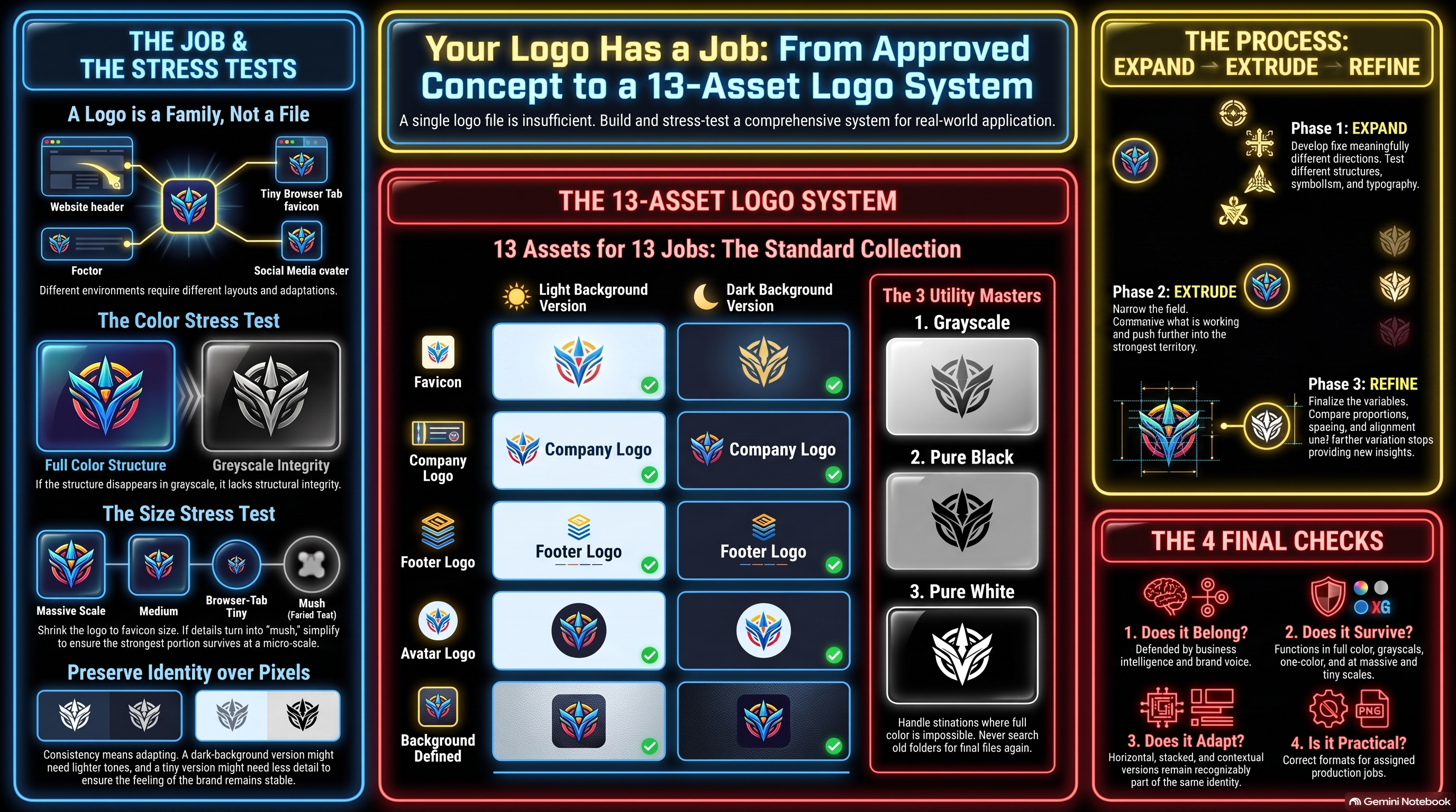
There is a wonderful moment in designing a logo when you finally look at it and think:
Yep. That's it.
After staring at different fonts, symbols, colors, arrangements and ideas for entirely too long, something finally clicks. It feels like the company. You can picture it on the website. Maybe on a shirt. Maybe on the side of a truck someday.
Save the file. We have a logo.
Except...
We don't.
We have one version of a logo that looked good in one particular situation.
And that's when the poor thing has to go get a job.
Put it in the header of a website and suddenly it's too tall.
Put it in the footer and the horizontal version feels awkward.
Shrink it into a favicon and the clever little detail that made everyone love it becomes six blurry pixels.
Put it against a dark background and half the mark disappears.
Convert it to black and white and two colors that were doing completely different jobs suddenly become the exact same shade.
Crop it into a social media avatar and discover that Facebook apparently has strong opinions about your geometry.
None of that necessarily means the logo was badly designed.
It means a logo doesn't live in the place where it was designed.
It has to survive everywhere else.
A Logo Is Really a Family
For a long time, I thought about logos primarily as files.
You need the logo.
Then you need the transparent logo.
Then somebody asks for a square one.
Then a white one.
Then somebody needs a version for a dark background.
Then you need a favicon.
Then a printer asks for something you've never heard of and you're searching old folders for FINAL_LOGO_REAL_FINAL_3.png.
Eventually it becomes obvious that these aren't miscellaneous exports.
They're a family of related tools.
The horizontal logo solves one problem. The stacked version solves another. The favicon isn't simply the big logo made tiny. A social avatar has its own environment. A one-color version has to survive without the color relationships that may have carried much of the original design.
They all need to look unmistakably related.
They don't necessarily need to be identical.
That's an important distinction.
Preserve the Identity, Not Necessarily the Pixels
Brand consistency is sometimes interpreted as rigid reproduction.
Never move this.
Never change that.
Always use these exact colors in exactly this way.
There are certainly parts of a visual identity that should remain stable. That's how recognition develops.
But consistency isn't the same thing as refusing to adapt.
Suppose a logo uses a deep blue and a medium blue beautifully against white. Put the same colors against a dark navy background and one of them may practically disappear.
Keeping the exact color because “that's the brand color” hasn't preserved the identity.
It's damaged it.
A dark-background version might need a lighter treatment. A favicon might need less detail. A one-color logo may need two overlapping forms separated differently because color can no longer distinguish them.
The better rule is:
Preserve the identity, not necessarily the literal color values.
The same principle applies beyond logos, of course.
Responsive websites rearrange themselves.
Typography changes size.
Spacing contracts.
Photographs crop differently.
A visual identity has to bend without becoming somebody else.
Take Away the Things That Make It Easy
One of the more revealing ways to judge a logo is to start taking things away from it.
Take away the color.
What happens?
If two important colors turn into nearly identical gray, some of the structure may disappear with them.
Now take away the gray.
Make the whole thing pure black.
Still work?
Make it pure white.
Still recognizable?
Now make it tiny.
Really tiny.
Not “designer zoomed to 400% while working on the favicon” tiny.
Browser-tab tiny.
What survives?
It's a little like stripping a song down from a full studio production to somebody sitting on a stool with an acoustic guitar.
Sometimes you discover there was a very good song underneath everything.
Sometimes you discover the fog machine was doing more work than expected.
Neither discovery is useless.
This Is Getting More Interesting With AI
Generative AI makes the first part of logo development astonishingly inexpensive.
We can produce concepts, change directions, test symbols, try typography, alter compositions and compare ideas at a pace that would have been impractical not very long ago.
That's wonderful.
It also makes it incredibly easy to confuse “I generated an image I love” with “I have a finished logo.”
Those aren't the same accomplishment.
The generated concept may still need cleaner geometry, corrected lettering, deliberate spacing, transparent-background preparation, simplified small-format versions or proper vector recreation.
Sometimes AI can handle more of that work too.
Sometimes a design program is the better tool.
Sometimes this is exactly where a professional designer earns their money.
The interesting part is that AI doesn't have to finish the job to have transformed the job.
Instead of approaching a designer with:
“I don't know. Something clean and modern?”
you might arrive with a direction you've already tested twenty ways. You know which symbols felt wrong. You know which typography belonged. You know what happened when the design became simpler. You know what you want preserved and where you're willing to experiment.
You're not handing them a blank page.
You're handing them a problem you've already learned quite a lot about.
Maybe That's the Better Role for AI Anyway
I've been thinking about this beyond logos.
There's an understandable temptation right now to judge AI by whether it can completely replace a process.
Can it make the logo?
Can it build the website?
Can it write the campaign?
Can it make the video?
Sometimes the answer is yes.
But that's not the only useful question.
What if AI gets you 60% of the way there?
Or 80%?
Or 95%?
If the remaining 5% benefits from somebody who has spent twenty years mastering the craft, that doesn't make the first 95% worthless.
And if AI eventually gets good enough that the expert looks at the result and genuinely can't improve it?
Great.
Use it.
The objective isn't to preserve manual labor for ceremonial purposes.
The objective is to produce good work while understanding what makes it good.
That's a distinction I suspect is going to matter more as these tools improve.
Don't Surrender the Understanding
There's a difference between delegating production and surrendering understanding.
Those two things are getting lumped together far too often.
Using AI to generate twenty logo concepts doesn't require giving up judgment about which one belongs.
Using AI to build a website doesn't require becoming incapable of understanding what the website is doing.
Using AI to write an email doesn't mean nobody should understand the customer receiving it.
The better these systems become, the easier it will be to stop learning what happens underneath the result.
That may save time.
It can also create a strange kind of dependence.
You own the output but don't quite understand why it works, how to change it, or what to do when it doesn't.
I'd rather have the leverage and the understanding.
Back to the Poor Logo
After all that philosophical wandering, our logo is still sitting there waiting for a job.
So give it one.
Put it against white.
Put it against dark.
Make it horizontal.
Stack it.
Put it in a square.
Give it a defined background.
Take away the color.
Make it black.
Make it white.
Shrink the poor thing until it begs for mercy.
If the identity survives all of that, you have something much more useful than a beautiful image sitting in a folder.
You have a logo system.
And when somebody inevitably asks for the logo in a format you haven't thought about yet, you'll have enough understanding of the identity to make one more version without accidentally inventing a new company.
──────── ⚡ ────────